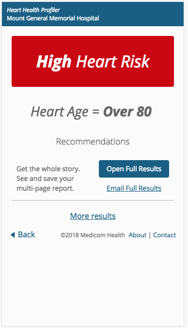
We’re excited to unveil the new results page design for our “version 3” Health Assessments. This simplified design makes it easier and faster for users to get the results they’re looking for and take the next step in their health care journey with your organization.
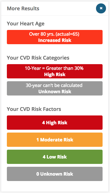
One of the biggest changes involves a “rolled up” version of a user’s Health Assessment results. This means that users will see their most important result front and center on the results screen. They can then click into the “more results” pop-up modal, which will show them other important results and prompt them to view their PDF report.
Other highlights include a simplified and streamlined design; a large, unmistakable primary result; and clear, understandable calls to action.


 Thank you for your interest.