What’s New?
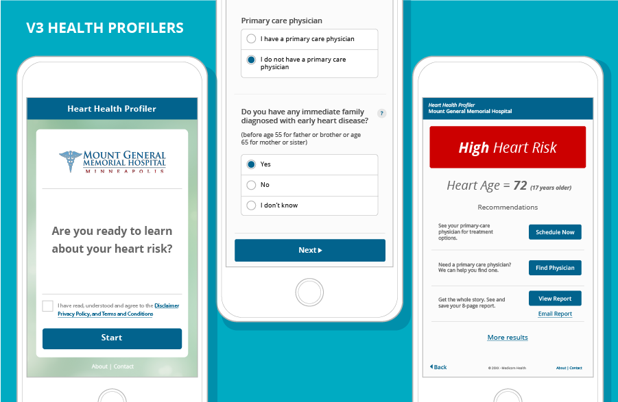
We’re excited to announce our new, responsive mobile design for v3 Health Assessments. This new design was built with a mobile world in mind and aims to move users through your Health Assessment with greater ease and less frustration.
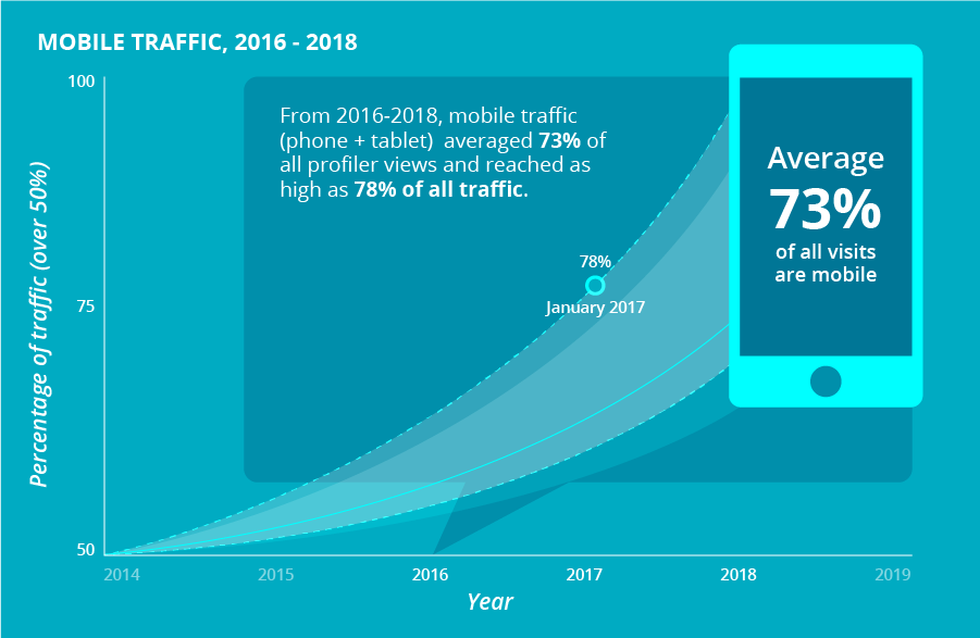
Mobile is now the primary screen of today’s world. Since 2014, mobile traffic (phones and tablets) for HRAs has increased sharply, reaching as high as 78% of total traffic.
A few key points about our new v3 mobile design:
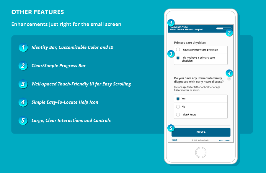
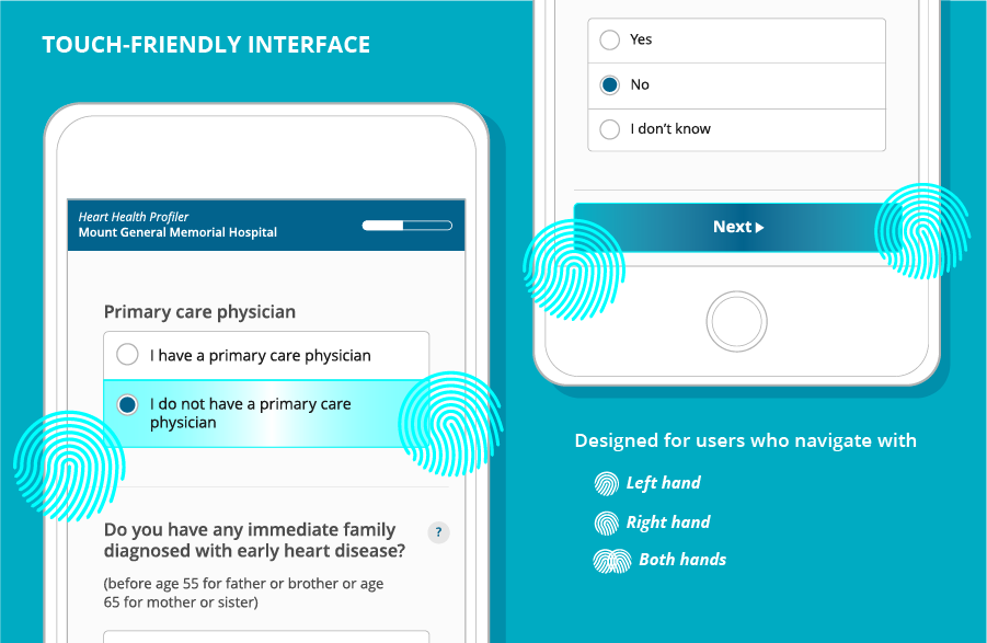
- Larger buttons and a touch-friendly interface mean HRAs can be easily completed by both right- and left-handed users
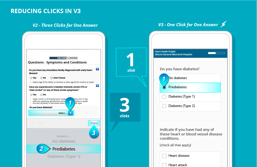
- We’ve reduced clicks throughout the whole v3 experience by employing tactile, touch-friendly design with the mobile screen in mind; this means eliminating drop-down menus on Q & A pages and minimizing the presence of scroll wheels. Users simply click on their desired answer and move on, keeping their momentum from start to finish.
- Title bars are customizable and designed for a mobile screen
- New global progress indicators help your users know exactly where they are in the process
- Re-designed global help icons are now placed clearly and constantly throughout Health Assessments, so help is always a single tap away
- The new design also includes larger fonts and controls, making for seamless interactions from start to finish
To learn more about our v3 design, contact your Strategic Client Partner today.



 Thank you for your interest.