Watch this 5-minute video on writing effective calls to action.
Powerful calls to action are essential to turning website visitors into patients. People come to your hospital’s website for a reason. It’s to either do something or learn something.
A compelling call to action (CTA) is what makes your readers do something. But many marketers are missing details that can make your CTA go from ordinary to great. And in most cases, the changes aren’t significant; it may be as simple as changing a few words, switching the color, or placing it in a new location on your web page or email. Here are some tips to improve your calls to action.
Make the CTA prominent
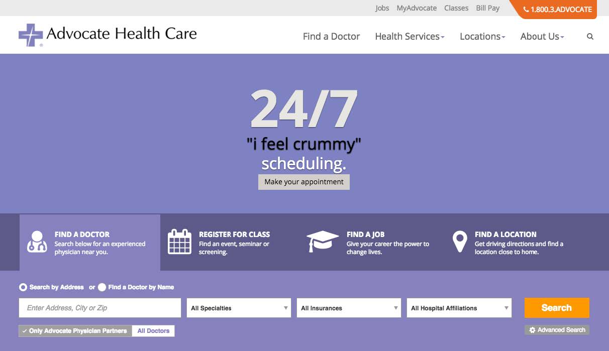
The CTA should visually stand out from the surrounding content. Otherwise, it may go unnoticed. Contrasting colors, position on the page, unusual shapes, and other eye-catching visual elements will make your CTA pop. Research shows that color elicits emotions, so depending on your audience and page design, you should test which color prompts action. Advocate Health Care’s homepage has a prominent “Make your appointment” CTA that is concise and impossible to miss.
Keep it short
Research shows that CTAs between two and five words perform best. Avoid CTAs longer than ten words as they won’t perform as well as shorter ones.
Use strong action verbs
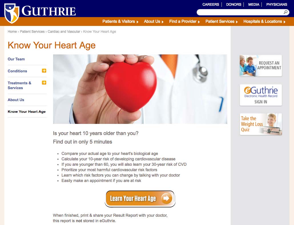
Calls to action need to be clear and concise. Your CTA should start with a verb that encourages visitors to take specific action. Examples include Download, Learn, Join, Get, and Start. You want to use words that create a sense of urgency and will motivate visitors to act. Verbs projecting urgency include Now, Limited-time, Today. Guthrie has a prominent “Learn Your Heart Age” on their web page to encourage visitors to take the Medicom Health Heart Health Assessment.
Support your CTA with compelling messages
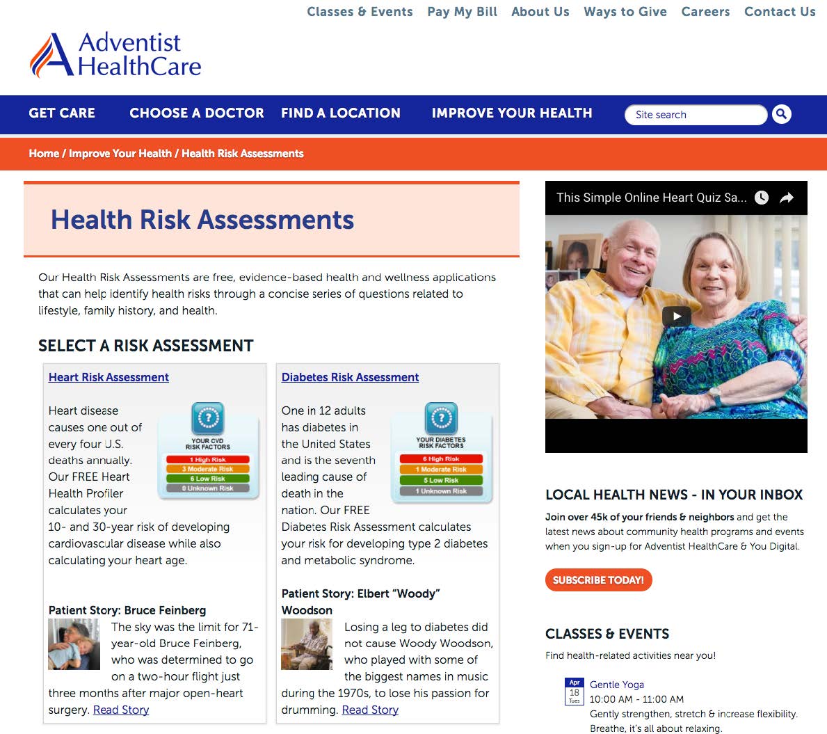
Visitors may be hesitant to give you their personal information. By providing a compelling message that supports your CTA, you increase the chance of visitors acting. Examples include patient testimonials, guarantees (such as “see a specialist within two days”), and privacy promises. Adventist HealthCare does a terrific job of providing patient stories to promote their health risk assessments.
Make it easy to submit
You’re likely to have fewer CTA conversions if there are too many steps between the first click and completing the process. If you’re collecting information, limit the number of fields to only what is necessary.
Provide options
When you offer a choice, visitors often feel more in control and more likely to act on your calls to action. By providing choices, each choice should support the CTA. For example, present two CTA buttons such as “Yes, I want my health assessment” and “No, I don’t care.” Remember, always to keep it clear and straightforward.
Test, then test again
Even if you’re convinced your call to action is perfect, you will only be certain once you test it. Use A/B testing to learn the effects of changing the message, offer, colors, placement, etc. In many cases, even small changes can make a big difference in conversion rates.


 Thank you for your interest.