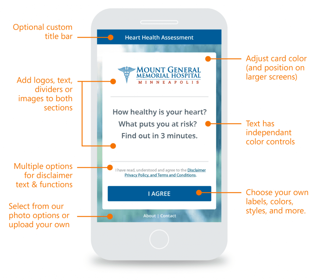
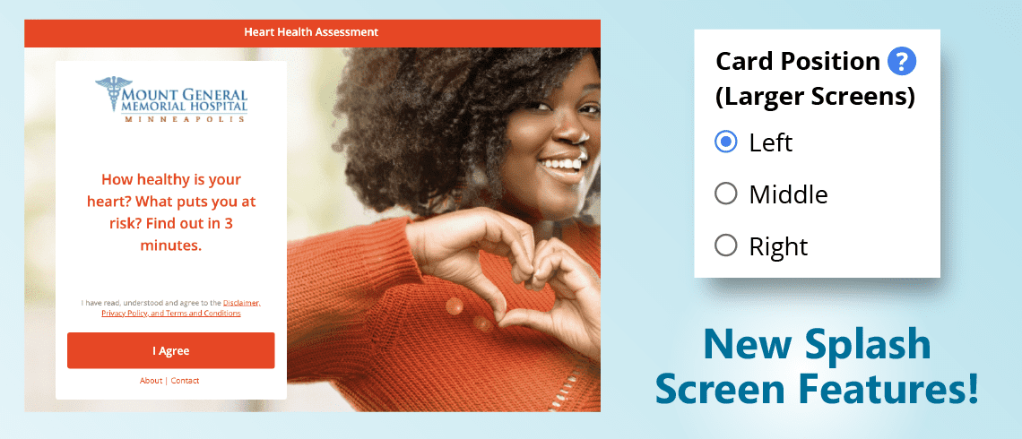
We’ve recently added some new splash screen features, some specifically for desktop & laptop screens, in response to a client request. One of our health system customers had a great hero image from a service line campaign that they wanted to use in their related HRA splash screen. Unfortunately, our standard configuration obscured the subject of the image. This initially led to us allowing the “card” to be offset from the center, like shown above. This alone is a pretty cool upgrade. But we didn’t stop there.
Next, we added a bunch of new customization options for the card itself to those we already had. These include total control over card color and all elements on the card. For example, you could even do an attractive dark card if you want. At first glance it just looks like a few more settings, but we really feel these are optimized to provide you a great deal of flexibility to create new looks without too much complexity. This can help you freshen a long-standing HRA you have been using for awhile or help differentiate a one-off use of a new HRA for a narrow use case. Ultimately, it is about creating an experience that draws more users into the assessments.
 Other New Splash Screen Features
Next, we expanded the stock photos we provide for background choices. Many of these have off-center areas of focus and work great with offset cards.
As an aside, if you are on a budget and looking for more choices for these kind of assets, I saw that you can get weekly free images here.
Examples
Here is an additional example. In the coming weeks we will be using these new features to build more sample splash screens like this so clients can quickly understand the potential that is available to them.

Conclusion
We hope you can put these new splash screen features to good use. If you ever want help, or have ideas for other improvements (especially around splash screen optimization) feel free to contact us. Your choices for HRA title, card text, and disclaimer configuration can REALLY have an impact on HRA performance, so let us help you make great selections.
FYI, for a more detailed breakdown of the user interface for these new features, click here to go to the feature support page.


 Thank you for your interest.