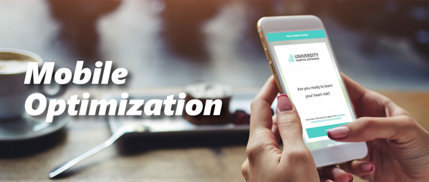
Mobile optimization of consumer-facing content is critical today. For example, nearly 80% of our HRA completions are happening on mobile devices. To that end, we have made it as easy to configure all of the most mobile-friendly options for your HRAs with one setting.
In the Customization tab of the Management Portal, you can toggle on an option called, “Mobile Optimization.” Enabling this setting streamlines the mobile experience by removing the following content:
- Intro page
- Sidebars
- Client logo on interior pages
- EVALIA logo
- Newsletter sign-up (if enabled)
- “Knowing Your Numbers” pop-up (where applicable)
- “Contact Information” and “About This Assessment” links on interior pages
- Second and optional third text bullet (Privacy Info) on Contact Information Form
This results in a much quicker and smoother user experience. On a laptop, this additional content is nice to have, but for mobile users, it mostly slows them down.
BTW, in our new v3 format, these options are baked into the mobile experience automatically. In the meantime, it will only take a few minutes to improve the mobile-friendliness of your Medicom Health assessments.


 Thank you for your interest.