Medicom Health’s v3 HRAs have ushered in many improvements that have helped our clients’ completion rates soar. Along with the changes, though, came the removal of lesser-used features that some marketers appreciated as part of their v2 strategies.
Understanding this, we want to make sure we are providing a better, more effective way to communicate your message to potential patients. Here are a few suggestions that can help you accomplish your goals in our new v3 platform:
Custom Sidebars
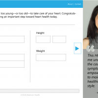
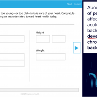
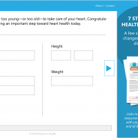
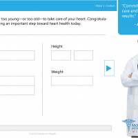
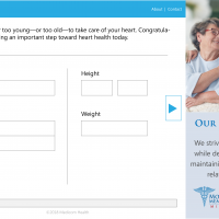
Available on the desktop version of our HRAs is the custom sidebar feature.
This space is clickable and can be used to promote:
- patient stories
- new providers
- nearby locations
- improved services
- cutting-edge equipment
- available procedures
- awards and recognition
- upcoming events
- or any other news worth sharing.
Changing sidebar images out is simple, so marketers can be timely and seasonal in the imagery used. Just remember that if you make the sidebar clickable, set the new page to open in a new tab/window. This avoids directing consumers away from the HRA before they’re done.
Early Email Collection
This feature is a recent addition to the Medicom Health portal. Early email collection allows marketers to capture email addresses at the beginning of an HRA, rather than at the end. This means if a consumer gets pulled away because they don’t have an answer, get a phone call, or have to pick up the kids from practice, marketers can email them to encourage users to come back and complete the HRA. Worth mentioning is that there may be a slight drop in completions by asking for email upfront, but with v3 most completion rates are already heightened, and the ability to remarket means that you will capture those who dropped off when they are distracted by everyday life.
Splash Screens
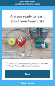
When consumers first get to the HRA, what do they see? Is it an engaging image or a picture of a hospital? Is the brand recognizable or non-descript? The start page of HRAs are a make-or-break moment and need to pull the consumer in so they commit 2-4 minutes to your brand. A few tips that work well include:
- Use different images for each HRA. What works for a Heart Health audience may not resonate with a Breast Cancer audience.
- Be campaign-specific. Just like Colon Cancer and Lung Cancer campaigns differ, so should their splash pages.
- Keep it simple. Remember, first impressions matter: clean imagery with limited words will be the least distracting look for your HRA.
- If able, limit the checkboxes a user needs to select for things like Legal Disclaimers and opt-ins. This reduces barriers to entry and gets consumers “in the door” more quickly.
Custom Questions
Need to know a consumer’s insurance type? What types of medications someone is taking? Which clinic location is nearest their workplace? Custom questions are the solution. We give you the opportunity to purchase up to 8 additional questions per HRA. Drop-downs, text boxes, numeric fields, radio buttons, even checklists are all options and add flexibility to make the HRAs specific to the individual organization’s needs. These questions appear at the end of the HRA, do not affect the primary result/score, and populate in Raw Data, allowing marketers to use the resulting data in the most effective possible way.




 Thank you for your interest.